We’re diving into Android 12 Developer Preview 1 to try and find all that is new from Google’s next big release. We actually expect Android 12 to offer several changes and new features, most notably a revamped UI experience, so this could be a fun post to pay attention.
What we’ll do here, like we always do with new Android releases, is constantly update to show you the changes, both big and small, to Android 12. If you were looking for the developer-related changes, you’ll find those over here.
Ready? Here we go!
“Silky Home” Settings UI
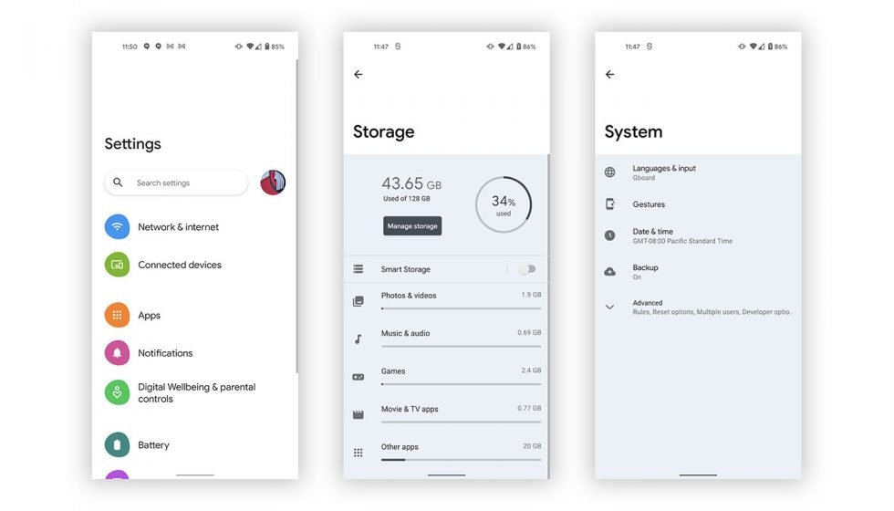
Google is reportedly working on a new UI for Android 12 that is called “Silk” and the first bits of evidence of it have appeared in the first Developer Preview. We enabled the new UI, which for only changes the settings area to look a lot like Samsung’s One UI. You can find more on it here.
Double Tap Back Gesture
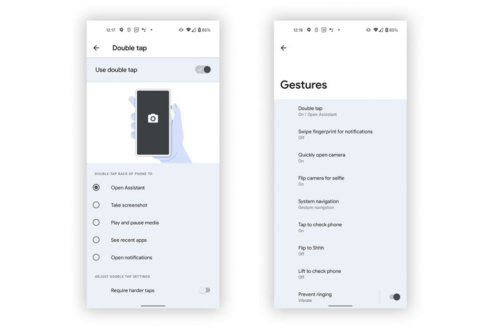
A new gesture has appeared (at least on my Pixel 5) for Android 12 DP1 that is preparing our phones to be able to double tap on their backs to perform tasks. This has actually been a rumored feature for a while, but the idea is pretty simple – you double tap on the back o your phone to launch Google Assistant, take a screenshot, see recent apps, play/pause music, etc.
At this time, you can enable the new gesture, but it does not appear to be working.
Media Controls Get New Settings
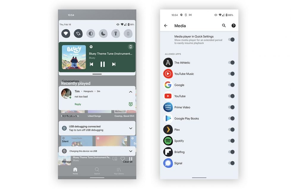
In Android 11, Google added media players to the quick settings area of the notification shade. It’s not the worst move, but the change hasn’t been without issues. In Android 12, Google is giving us all more power over what shows up in that area by allowing us to toggle apps on and off. In the screenshots above, you can see that there is an off switch, but also individual switches for each app that might want to slap a media player up there.
Notification Area Changes
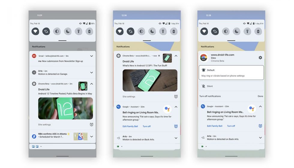
Google is doing a lot in the notification area in this first preview. They’ve kept the groupings, but there is a blueish vibe to the color scheme when light theme is active, the icons for each have more color and a circle outline, previews look cleaner, the snooze button is more visible, etc.
Dark Theme Tweak
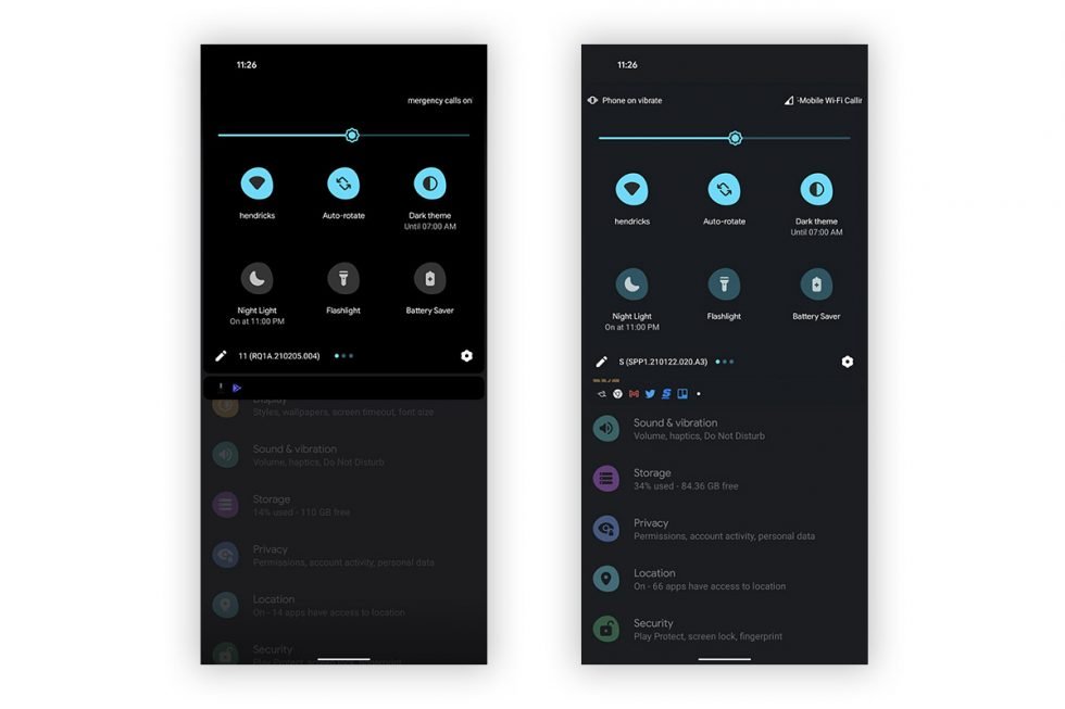
Android 11 vs. Android 12 DP1
This is a pretty minor change, but with dark theme enabled, the notification shade on Android 12 is no longer fully black. Instead, it’s a greyish-blue that is still dark, but not black.
Toggles!
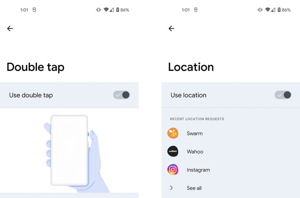
Another super minor tweak, but in some settings, the on/off toggles have check marks to tell you that the option is actually on. That’s nice.
Updating…
