Samsung overhauled its software efforts in the last two years, turning One UI into one of the best interfaces on Android. It did so by making gradual changes to the UI to make it feel more cohesive and modern, getting rid of TouchWiz elements, and adding unique features to allow One UI to stand out.
With Android 13 on the horizon, Samsung is working on the One UI 5 update for later this year, and we should be seeing a beta release sometime at the end of Q3. The current One UI 4.1 build gets a lot right: It has all the features Google introduced in Android 12, with Samsung offering its own take on the Material You color picker, introducing smart widgets that combine widgets so they don’t take up as much room on your home screen, camera tweaks — including a magic eraser feature similar to the Pixel 6 series — and so much more.
These are five things that would be a great addition to One UI 5.
System-wide themed app icons
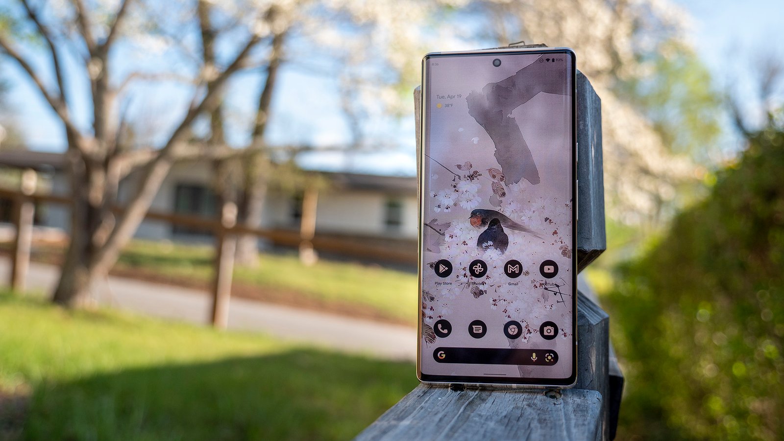
We haven’t seen much in the way of features in Android 13 yet, but we know that Google is introducing system-wide themed app icons. Basically, Google is asking devs to use monochromatic app icons when they submit app updates, and by doing so, third-party apps will be themed in the same Material You palette as the rest of the interface.
This is different to how the feature worked in Android 12 — whatever accent colors you set were limited to Google and Samsung’s apps, making the UI look inconsistent. Thankfully, that’s changing in Android 13, and I want One UI 5 to adopt this feature. And talking about icons, it’s incredulous that Samsung still doesn’t offer a way to change an app icon’s shape within One UI. Most Chinese manufacturer skins had this feature as standard for some time now, and I want to see One UI 5 fix this oversight.
Better Material You color picker
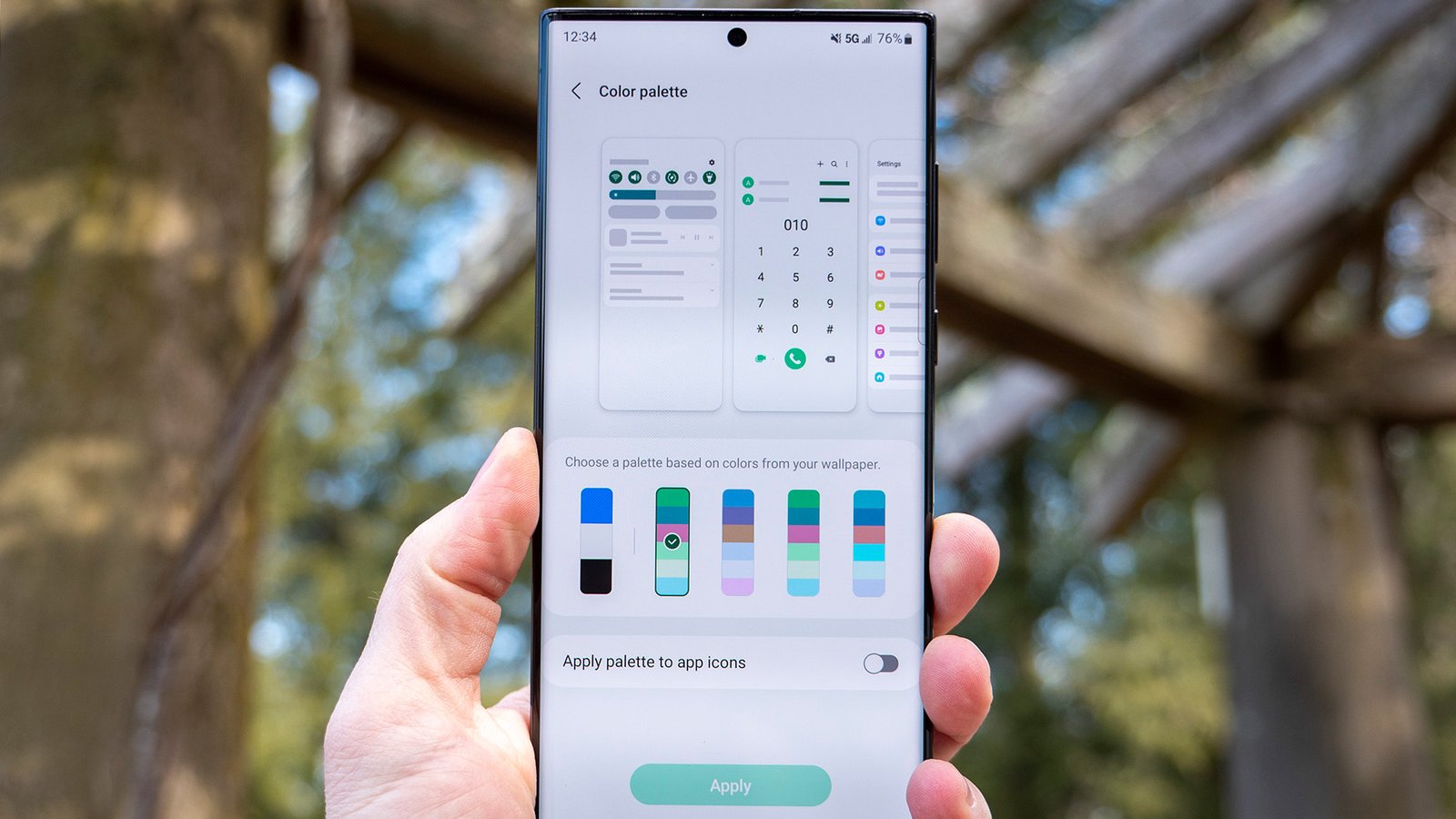
On the note of customization, one feature I’d like to see in One UI 5 is the ability to set my own Material You color palette. In its current iteration, the feature picks out colors from whatever background you have on your phone, and you have the option of choosing the color palette based on those colors.
One UI 4 lets you select between five different palettes, and for its part, Google’s color picker feature works in a similar fashion. But OPPO’s ColorOS 12 does things a little differently — it lets you choose between the usual five color palettes that are selected based on your phone’s background, but you also have the ability to pick custom colors.
You can drag four dots over the background to individually pick colors, but if you don’t want to use any of these options, you can just set your own via a color wheel. It is a powerful feature, and OPPO did a good job with its implementation. I want Samsung to introduce a similar feature in One UI 5 that lets me pick the colors I want.
Adjustable Dark Mode
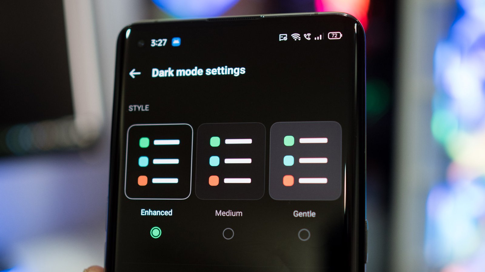
ColorOS — and by extension OxygenOS 12 and Realme UI 3.0 — lets you choose the intensity of dark mode, with three settings available: Enhanced, Medium, and Gentle. The Enhanced option is a fully dark option that switches UI colors to black, Medium changes the UI to dark grey, and Gentle has a lighter grey hue that’s ideal if you don’t like an all-black dark mode.
This is one of my favorite features within ColorOS, and Samsung should consider bringing a similar option to One UI 5.
Smoother animations
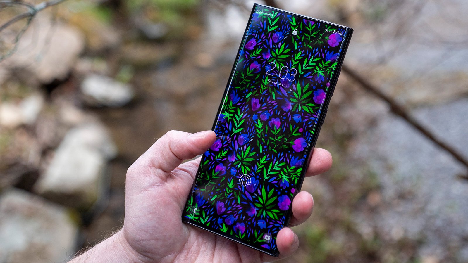
One UI 4 gets a lot right, but the one area where it’s lagging behind its rivals is smooth animations. The animations aren’t anywhere as fluid as they ought to be on my Galaxy S22 Ultra, and that’s immediately evident when using the phone alongside the likes of the Find X5 Pro or the Xiaomi 12 Pro, both of which have similar hardware and 120Hz screens.
In a similar vein, Samsung needs to optimize the camera as well. The interface itself has all the features you could ask for, but like parts of the interface, it doesn’t feel as fluid as the best Android phones.
UI optimization in particular is lackluster for Samsung’s mid-range Galaxy A devices, and even on the Galaxy A53 — which has powerful hardware and a 120Hz screen — I noticed the occasional stutter when navigating the UI and switching between apps. I don’t see such issues on other devices in the sub-$500 segment, and it’s clear that Samsung needs to do much better in this area.
Based on the little that’s known about One UI 5 at this point, it looks like Samsung is making this a priority, and it cannot come soon enough.
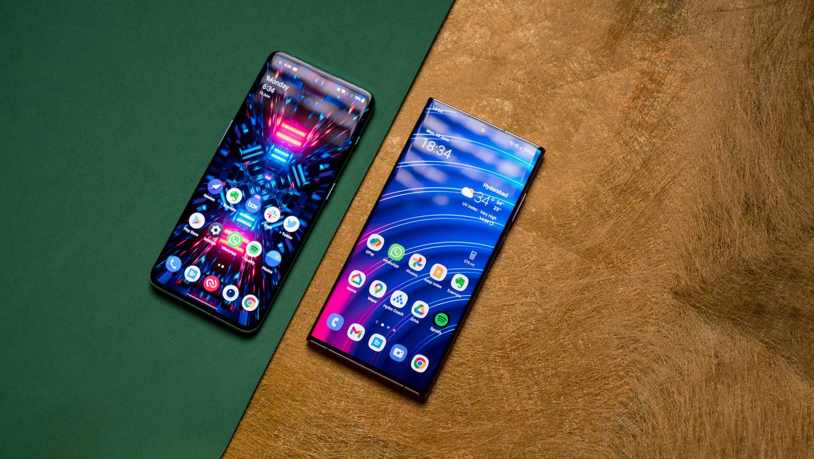
In 2022, all Android phones have a vertically scrolling app drawer as standard, barring Samsung. Samsung has gotten good at listening to customer feedback — it did a great job getting rid of ads within One UI 4 — but in a few areas, it continues to be obstinate.
As such, One UI 4 still has a horizontal app drawer, and it isn’t anywhere as user-friendly to navigate as a vertically scrolling option. If you’ve got a lot of apps installed, you’re just better off searching for it than trying to find the page it is in and locate its position in that page.
There are inherent issues with using the search pane as well; devices like the S22 Ultra are tall and unwieldy, so you’re unlikely to use the feature one-handed. At this point, it’s high time for Samsung to get on the bandwagon and introduce a vertically scrolling app drawer.
Get ready for One UI 5 later this year
Samsung made a lot of changes with One UI 4, and like Android 13 itself, One UI 5 is likely to be an iterative update with just a few major feature additions.
That said, there are a lot of areas where Samsung can make tangible changes, and with the first One UI 5 slated to arrive sometime in Q3, we don’t have to wait too long to get an early look at what Samsung has in store this year.
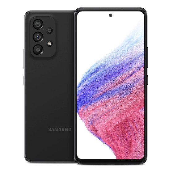
Samsung Galaxy A53
The Galaxy A53 is one of Samsung’s best phones of 2022. It has a vibrant 120Hz AMOLED screen combined with decent hardware, 5G connectivity, good cameras, and excellent battery life. Throw in four guaranteed Android updates, and it ticks all the right boxes.
This article was first published at Source link . You can check them out for other stuffs
