 Source: Harish Jonnalagadda / Android Central
OnePlus’ rise over the last six years is attributable to three key factors: robust hardware, clean software, and a strong focus on the community. By targeting enthusiast users and relying primarily on word-of-mouth advertising, OnePlus was able to sustain its initial momentum.
Of course, hardware had a strong role to play in OnePlus’ journey as well. OnePlus epitomized its Never Settle mantra by offering Qualcomm’s flagship chipsets for several hundred dollars less than the likes of Samsung, and that particular trait continues to this day on the likes of the OnePlus 8 and 8 Pro.
But the biggest differentiator for the company is software. From the beginning, OnePlus focused on a clean user interface devoid of any bloatware — a stark departure from its Chinese counterparts. While Xiaomi, OPPO, Huawei, and other Chinese manufacturers introduced value flagships with similar hardware as OnePlus, they couldn’t match the company when it came to software.
14 early Prime Day deals available right now!
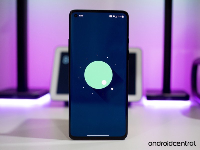
That focus on clean software and timely updates turned OnePlus into a fan favorite in countries like India, where it overtook Samsung to take the number one spot in the premium category. With OxygenOS 11, OnePlus is introducing a new visual aesthetic that sets the stage for the company’s shifting ambitions.
OnePlus is no longer selling phones just to enthusiasts, and the changes in OxygenOS 11 reflect just that.
While OnePlus started off catering to enthusiast users, it is now an established player in the smartphone segment. It rolls out flashy adverts featuring celebrities (Robert Downey Jr. is the brand’s ambassador), sells its devices via carriers in the U.S., and is building a retail presence in markets like India.
OnePlus makes some of the best Android phones money can buy, and this year the manufacturer is updating its portfolio to target a more mainstream userbase. The OnePlus Nord is the first salvo in that effort, with the phone available for the equivalent of $335 in India. OnePlus is building on the Nord with an even more affordable Nord N10 5G that will be available in the U.S., and an entry-level Nord N100 that will debut at just $200.
It would have been unthinkable for OnePlus roll out a device featuring Qualcomm’s entry-level snapdragon 400 series chipset just a few years ago, but the company is clearly expanding its horizons. That’s evident with the changes to OxygenOS; the OxygenOS 11 update is the biggest visual overhaul in OnePlus’ history and is designed to make the interface approachable to a wider set of users.
 Source: Harish Jonnalagadda / Android Central
As much as I like the simplistic styling of OxygenOS 10, the reality is that most people do not use stock Android. Google’s Pixels and Android One devices make up a tiny portion of the Android userbase, and to an average person, Android is synonymous with Samsung’s One UI. It’s no wonder, then, that OnePlus is turning to Samsung for inspiration for OxygenOS 11. A lot of the visual changes in OxygenOS 11 are designed to facilitate one-handed use and are similar to what Samsung introduced in One UI 2.0 last year.
To get a sense of the direction that OnePlus is taking with OxygenOS 11, I chatted with Sam Twist, Senior Product Manager at OnePlus. Twist is a part of OneLab, a small design team within OnePlus that laid the groundwork for the new visual layout.
OnePlus’ in-house OneLab design team laid the groundwork for OxygenOS 11 after extensive user feedback sessions.
OneLab is a 12-member team based out of London, New York, and Taipei, and as the team is outside the purview of the core OxygenOS teams based out of Shenzhen and Hyderabad, India, it gets more flexibility to take an overarching look at OxygenOS’ visual aesthetic.
OneLab regularly runs workshops and feedback sessions with the community to further develop new ideas, and sends the feedback “upstream” in an internal Demo Day that includes OnePlus CEO Pete Lau to figure out what ideas can be added to the OxygenOS roadmap. Where OneLab differs from OnePlus’ regular community efforts is that its efforts are focused on users in European and North American markets.
With OxygenOS 11, one of the key drivers was one-handed use. With screens getting taller and narrower, it’s no longer possible to interact with all the UI elements on the phone one-handed, so OnePlus focused on usability as a cornerstone for the changes to the visual layout:
OxygenOS 10.5 struggled to adapt to the changes in screen sizes over the last two years. It became a burden for users to reach all the UI elements, and one of the core values in OxygenOS 11 was to optimize the one-handed experience and deliver a UI that aided customers in their day-to-day usage.
Twist talked about this “burdenless experience” as the catalyst for the design changes in OxygenOS 11. Although the increases in screen sizes offer more real estate for adding UI elements, OnePlus was cognizant of making the interface too complex and confusing to users. So it instead focused on delivering a bolder interface with contrasting colors designed to make information stand out.
Twist mentioned that people use their phone in two ways: short bursts lasting just a few seconds to check an incoming notification or look something up, and settling in for a longer duration to consume content. The changes in OxygenOS 11 are designed to facilitate the former use case; with the bold colors making it easier to parse information at a glance.
 Source: OnePlus
OnePlus also looked at anthropometric data to figure out how people hold and interact with their devices, allowing the company to zone in on touchpoints that are easy to reach, require stretching, and are hard to access.
With this information in hand, Twist says his team was able to tailor OxygenOS 11 UI elements for one-handed use, with the buttons and menu options located in the easy-to-reach zone and the section at the top of the screen dedicated for displaying information.
That bold styling and contrasting colors make OxygenOS 11 look very different from earlier versions of the UI, and I made it very clear that I’m not a fan of the new look. That said, having used OxygenOS 11 for the better part of a month and understanding the sort of users OnePlus is targeting with the update, I get the reasoning behind the changes.
The usability-focused changes do make a difference in day-to-day use, and while OnePlus is aiming for a more mainstream userbase, it isn’t ditching customizability just yet. From Twist:
Customization is one of our core pillars; there’s more customization in OxygenOS 11 than ever before, and we’re unwavering in terms of offering choice. We have a bolder style, but we never set out to inhibit anyone’s usage of the device. This is also one of the main reasons why we rolled out the OxygenOS 11 beta to our core community so we can get early feedback from our users.
Twist said that initial OxygenOS 11 feedback from core users was negative, but as time went on and more users engaged with the beta, the overall feedback turned positive. He said that the OxygenOS team is continuing to take feedback from the initial beta builds and incorporate it into the stable build that’s slated to roll out sometime later this month.
OnePlus gathered feedback for several months in user workshops before it rolled out the OxygenOS 11 closed beta, and Twist mentioned that his team conducted a lot of A/B testing to fine-tune the interface changes.
 Source: Harish Jonnalagadda / Android Central
One of the key additions in OxygenOS 11 is the always-on display. OnePlus fans have been clamoring for AOD for a while now — Twist says it was the community’s most-requested feature — so with OxygenOS 11 the company not only added the feature, but also introduced a new Insight option that promotes digital wellbeing.
The Insight AOD style was designed in collaboration with the Parsons School of Design, and includes a vertical color bar that shows how many times you’ve unlocked your phone and usage over the course of the day.
The more you use your phone, the less color is left on the vertical bar, serving as a great visual reminder to use your phone less. Twist mentioned that the mode acts as the ideal gatekeeper:
We honed in on the idea of using AOD to assist people with their digital wellbeing and mental health. The AOD acts as the gateway for the phone; if we can add an impact there and make someone understand how much they’ve used their phone, we can make a difference.
The color bar almost fades away if you have a high screen-on time, and Twist said that the use of color as a subtle indicator for screen usage combined with the less-subtle unlock counter at the top served the ideal balance for the mode. Twist also mentioned that OnePlus is working on additional AOD styles that will debut in time for the stable rollout.
 Source: Harish Jonnalagadda / Android Central
OxygenOS 11 represents a big shift for OnePlus. While the company dominates the mind share, its market share is minuscule compared to Samsung, Huawei, OPPO, and Xiaomi. It is aiming to change that by turning its attention to the mid-range and budget segments, and the software plays a big role in making the company more enticing to a mainstream audience.
So in that context, the design changes in OxygenOS 11 make a lot of sense. The enthusiast community — while vocal — makes up a small minority of OnePlus users, and the company is focused on delivering meaningful changes to all of its users. That said, the features that made OxygenOS attractive to enthusiast users aren’t going away.
In addition to AOD, OnePlus is rolling out the ability to schedule dark mode, a new font that with better readability, exciting updates to Zen Mode, dynamic backgrounds, and short highlight reels from photos stored in your gallery. The Chinese manufacturer is continuing its commitment to timely updates, and the OnePlus 8T will run OxygenOS 11 based on Android 11 out of the box. So while the UI is getting a fresh coat of paint, the core of OxygenOS is still intact, and that’s welcome news to me.
Get More OnePlus 8

OnePlus 8 & 8 Pro
We may earn a commission for purchases using our links. Learn more.
