What you need to know
- Google is reportedly adjusting Search’s dark mode with a subtle blue tint instead of the usual dark gray.
- The new appearance enhances contrast, making text more readable, especially in low-light conditions.
- The Google app for Android is also testing this feature, but only in the latest beta version.
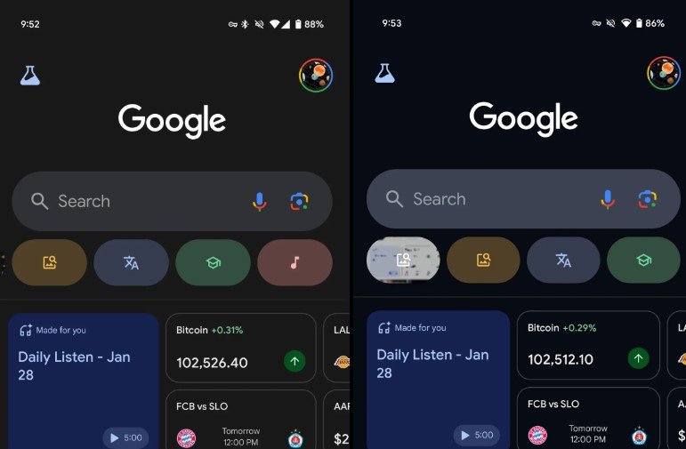
Google is making some changes to the dark theme in Search, incorporating a slight color twist. It’s a subtle update that may go unnoticed by many users.
According to 9to5Google, the new design swaps the typical dark gray for a richer, more vibrant blue. It’s a small but noticeable adjustment, indicating Google’s commitment to improving Search readability, particularly in low-light environments.
The exact rollout date of this new look is unclear, as per 9to5Google, but it may have been quietly introduced some time ago—possibly even a few weeks.
Currently, Google Search and the Android app utilize a dark gray theme, which serves its purpose but may come across as somewhat dull to some users. To inject some excitement, Google’s experiment involves a richer, bolder blue theme that is notably deeper and more vibrant than the current one.
The switch to this new color scheme increases the contrast between text and background, making content easier to read.
It may be challenging to notice this change at first glance. The current dark theme is predominantly dark gray, while the new version leans slightly towards a subtle blue tone. Fortunately, 9to5Google has provided side-by-side visuals that highlight the small yet noticeable distinction between the two.
If you’re having trouble spotting the new theme, try logging out of your account and using Incognito mode.
The new dark blue theme is also appearing in the Google app for Android, but only for users on the latest beta version. This update introduces a fresh background color to the Home and Search tabs, altering the appearance of search results within the app.
In the Google app, the blue dark theme isn’t limited to the background—it also gives a lighter blue makeover to the search bar and bottom navigation bar, creating an appealing contrast with the darker backdrop. However, not all sections have been updated yet; areas like ‘Saved’ and ‘Notifications’ still retain the old gray look.