I’ve recently had the chance to spend some time with the Galaxy S25 Plus, and while I haven’t fully delved into all the new features yet, my initial impressions of the phone have been quite positive. Having previously reviewed the Galaxy S24 Plus, the latest model from Samsung feels both familiar and refreshing. The strong emphasis on AI in this phone gives it a vibe more akin to a Pixel device rather than a typical Galaxy phone.
Here are a few highlights that have caught my attention while using the Galaxy S25 Plus.
Color is everything
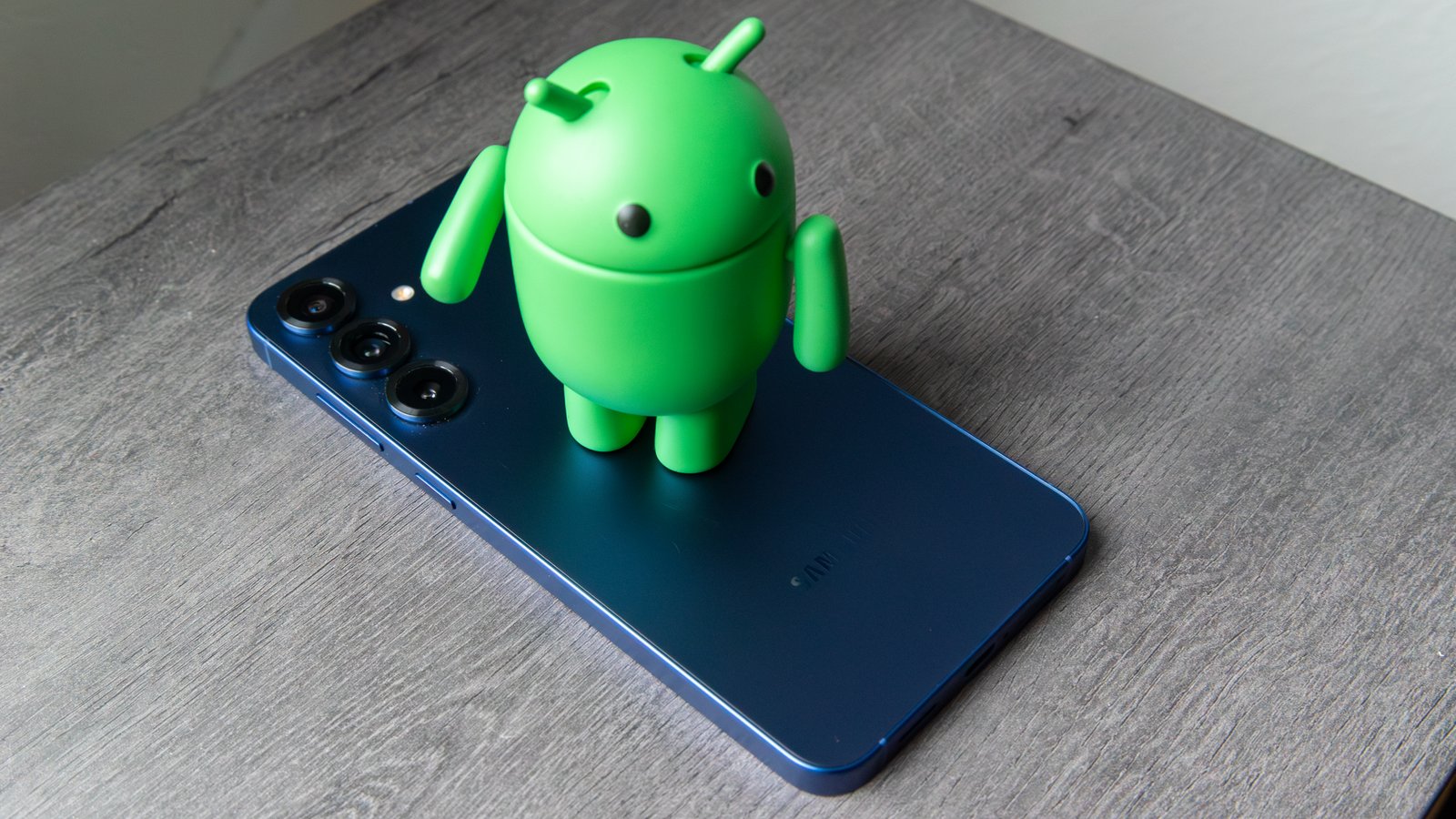
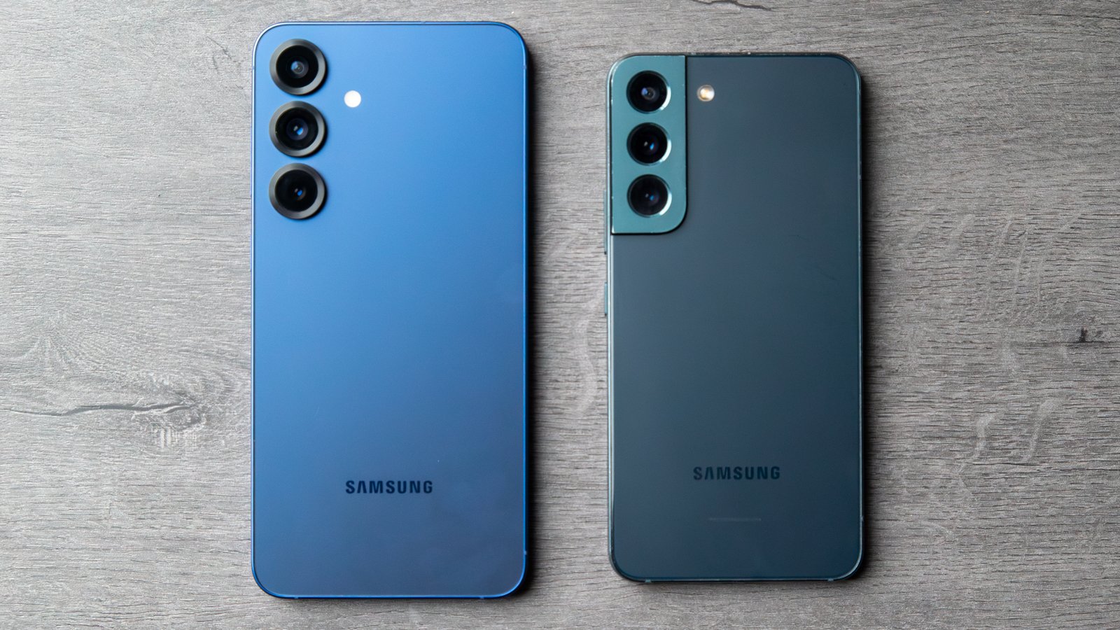
Over the past few years, I haven’t been particularly impressed with Samsung’s color choices. The predominant shades for the S series phones have gravitated towards pastels, which, in my opinion, made Samsung’s already uninteresting phones appear even more lackluster. While this year’s color options for the Galaxy S25 Plus still mostly lean towards dull choices, the standout color is the new Navy variant.
The Navy hue of the Galaxy S25 Plus is possibly Samsung’s best color release since the green Galaxy S22. Personally biased towards blue, I found the Navy shade to be a deep blue with a subtle shimmer that almost sparkles in direct sunlight, giving it an almost indigo appearance from certain angles and lighting conditions. The frosted glass back complements the thick black camera rings in the corner, while the flat frame emits a neon-like glow.
According to Samsung, the color is actually inspired by Galaxy AI, closely resembling the hue of the signature sparkle icon associated with many consumer-facing features on Android phones. Given the heavy focus on AI in the new phones, this integration of design with software is a clever approach. While the phone’s design may still be relatively subtle, especially when compared to other flagship Android phones like the OnePlus 13, a strong color selection really helps elevate the overall aesthetic.
This is a concept that Motorola exemplified with the Razr Plus 2024. Unlike phones that come in standard black, white, or silver colors, each Razr Plus 2024 variant boasts vibrant and unique colors, such as the Hot Pink option resulting from a collaboration with Pantone. While the Galaxy S25 series hasn’t fully embraced this approach yet, and some of the other color choices still lean towards bland pastels (which apparently have their fanbase), colors like Navy and the Samsung-exclusive Coralred make the Galaxy S25 Plus far more intriguing than its predecessor.
One UI 7 is smooth like butter
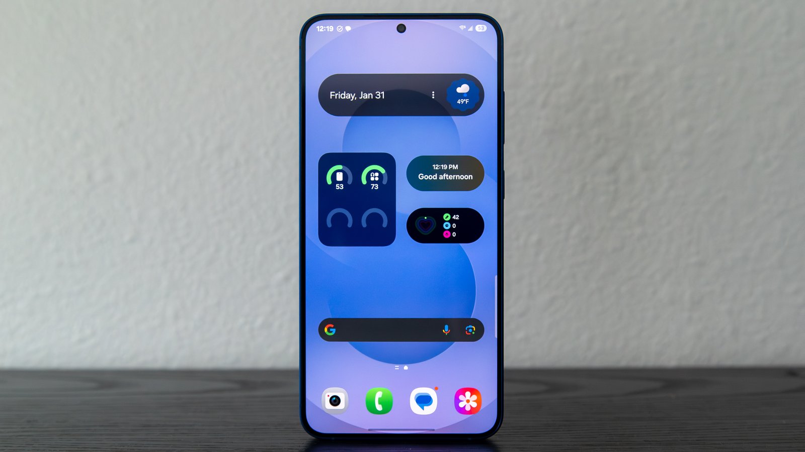
While the Galaxy S25 Plus may not sport significant exterior changes, once you power on the device, a different story unfolds. One UI 7 offers a delightful user experience, and I’m inclined to say it’s the best iteration of Samsung’s software thus far.
I’ve always been a fan of One UI for its efficient use of screen real estate, surpassing the Pixel software in my opinion. With Android 15, Samsung has made several changes that give the software a slightly more Pixel-like appearance with its rounded UI elements while retaining the efficient Samsung touch that I appreciate. The addition of a vertical app drawer is a notable improvement. Previously, achieving a vertically scrolling app drawer required installing the Good Lock app and navigating through various modules and settings. Now, a simple switch to alphabetical sorting transforms the default horizontal pagination, making it a more user-friendly UI element.
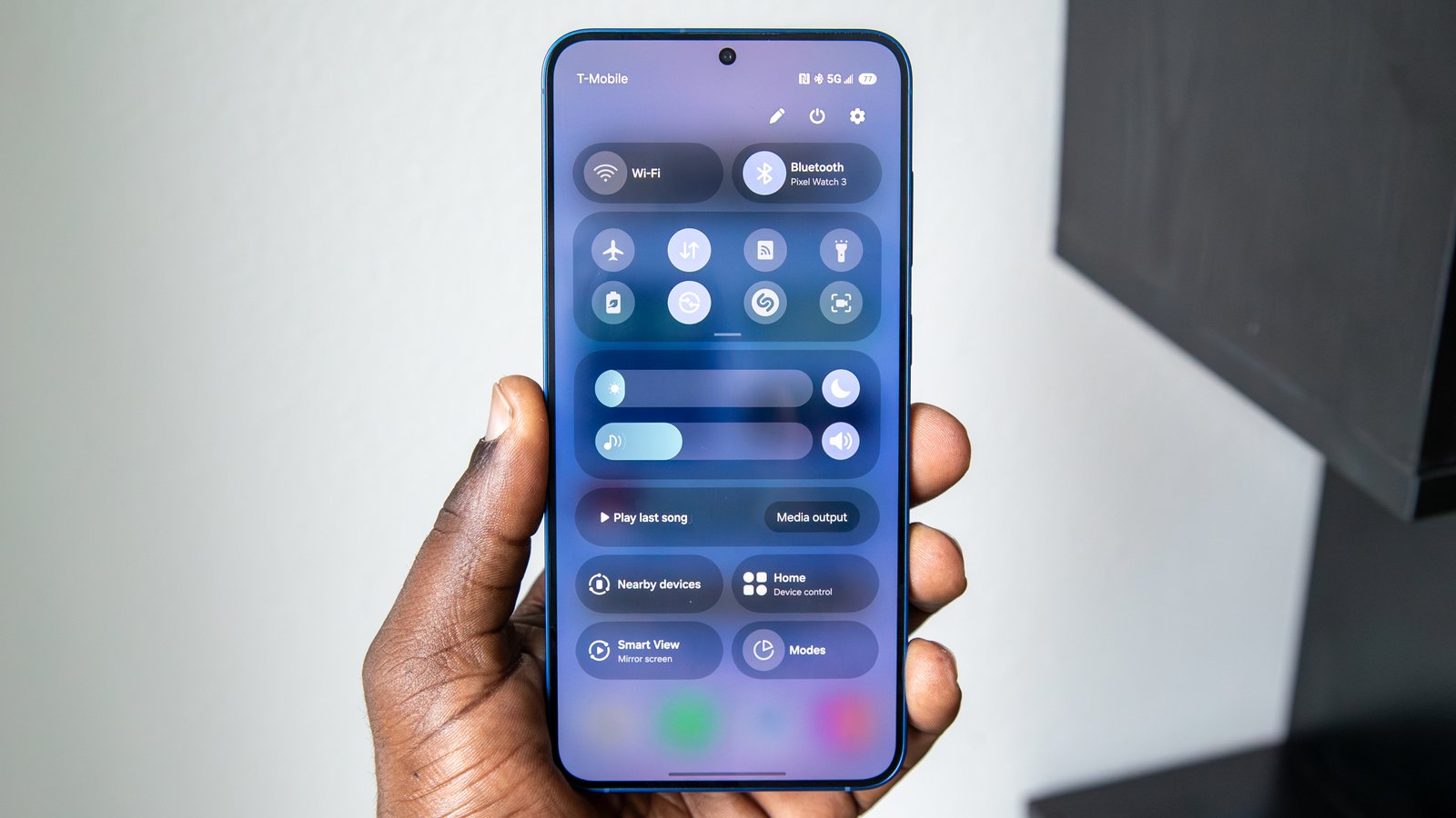
The Quick Panel and notification shade have been redesigned. Though they are separated by default, this Apple-inspired UI approach has grown on me, particularly after experiencing similar implementations from other OEMs like Motorola. I particularly appreciate Samsung’s revamped execution in One UI 6, which still includes handy features like Wi-Fi and Bluetooth toggles, brightness controls, media output settings, and more.
With One UI 7, the customization options have been expanded further, providing easy access to essential settings through an expanded Quick Panel. Samsung has also introduced an expandable panel for the customizable quick settings, replacing the traditional horizontal scrolling. The way notifications are grouped and displayed has also seen improvements, mirroring the new multitasking screen which stacks open apps behind each other for a more visually appealing and unified experience.